Line Dashboards
Navigation: OEE → Line Dashboards
Description:
- The Line Dashboards screen shows OEE and downtime for a whole production line and its units at once. Select a line's location and a time window (typically by shift), then switch between four views using the tabs across the top: States Swimlane, Line Overview, Unit Downtime, and Downtime Losses.
- Time is usually selected by Shift (a shift dropdown plus a range-in-weeks slider), though the views also support realtime windows.
States Swimlane
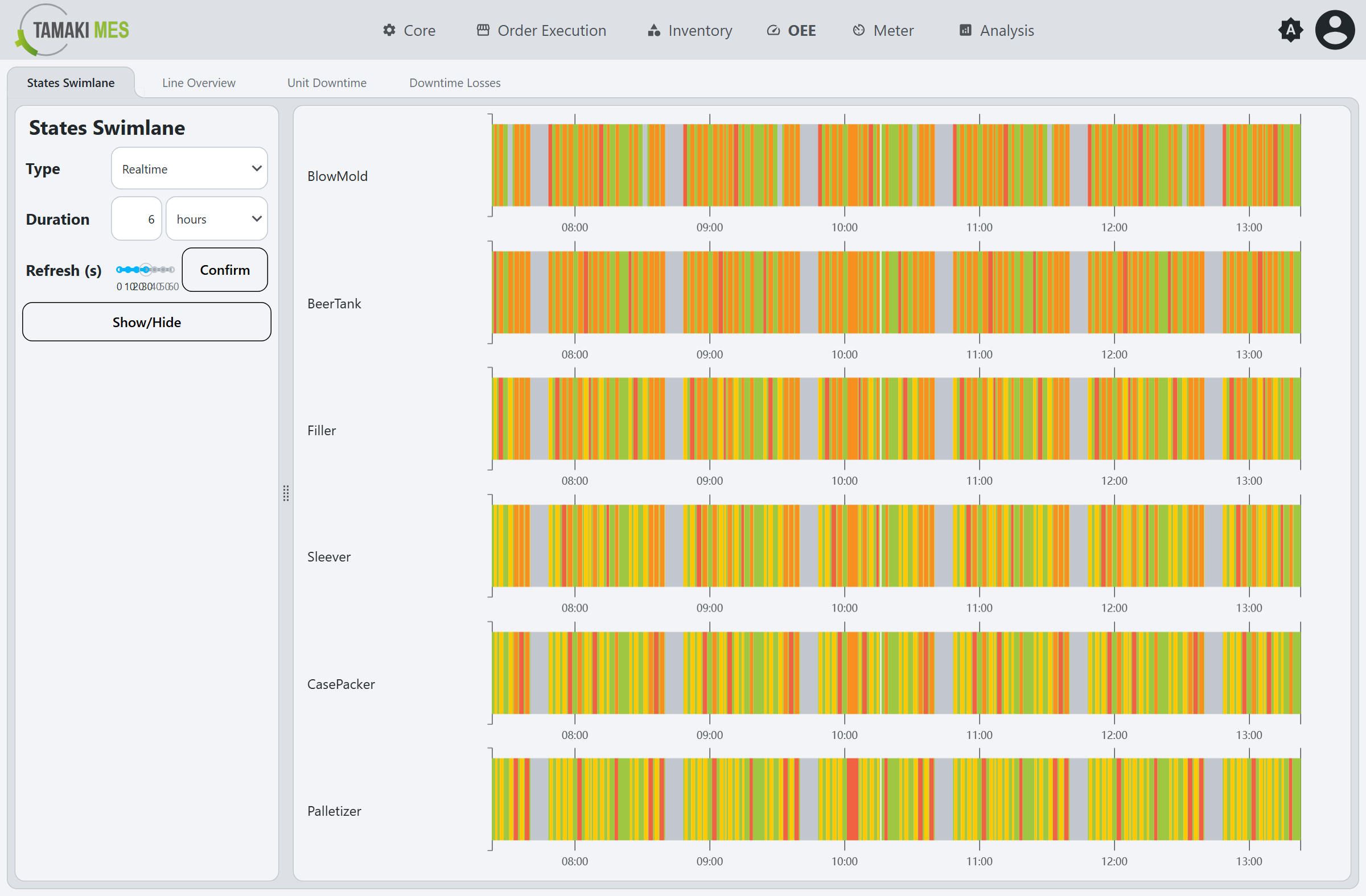
One State timeline lane per unit on the line, stacked so you can compare when each unit was running, down, blocked, or starved across the same time axis.
Line Overview
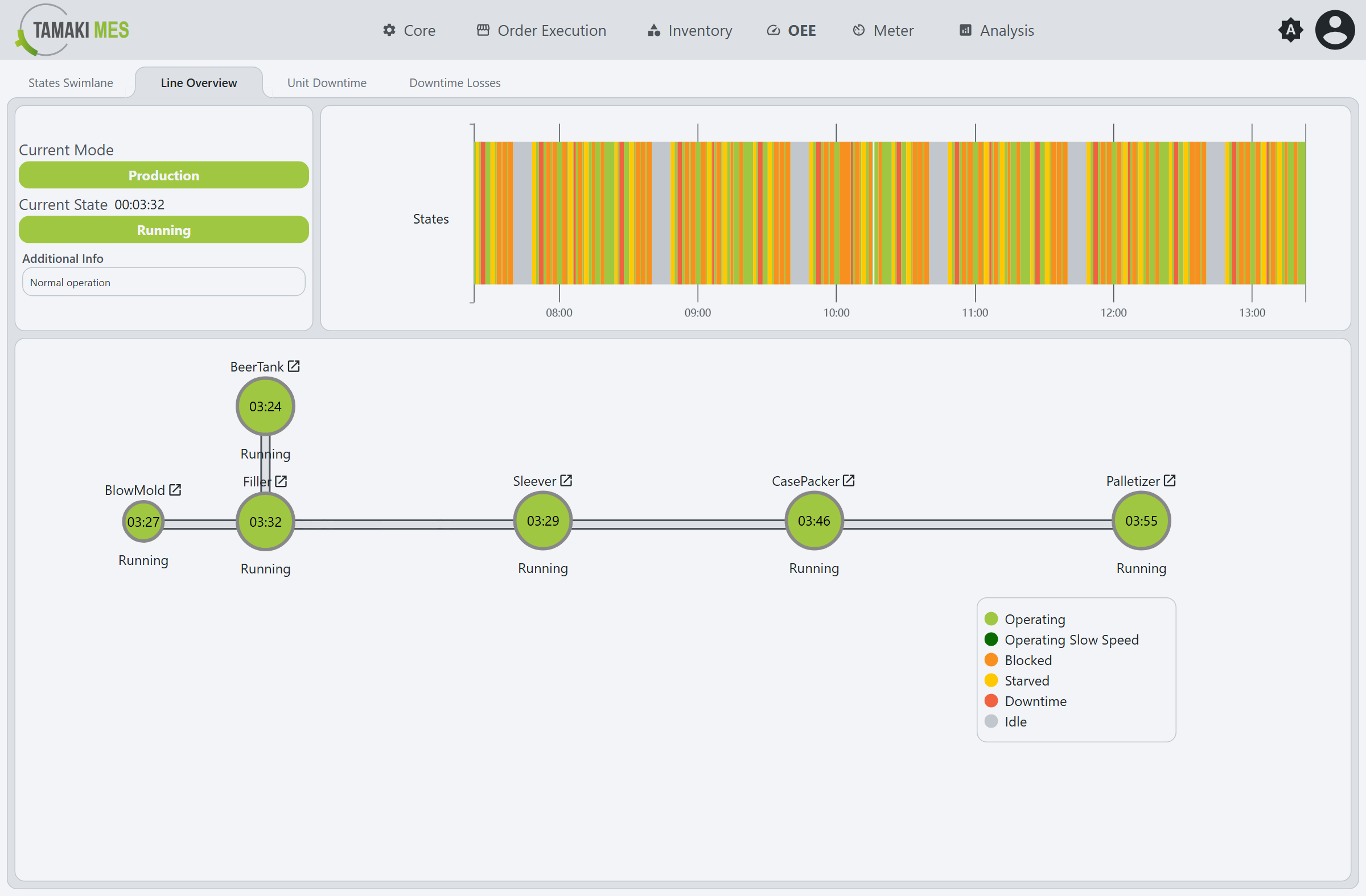
A live overview of the line: tiles for the current mode, current state, and additional info; a combined states swimlane; and a line topology diagram where each unit is a colored node (its color is the current state, with the time in that state) connected in physical line order. A legend maps the colors - Operating, Operating Slow Speed, Blocked, Starved, Downtime, and Idle - and each node has a drill-in link to that unit's Unit Dashboard.
Unit Downtime
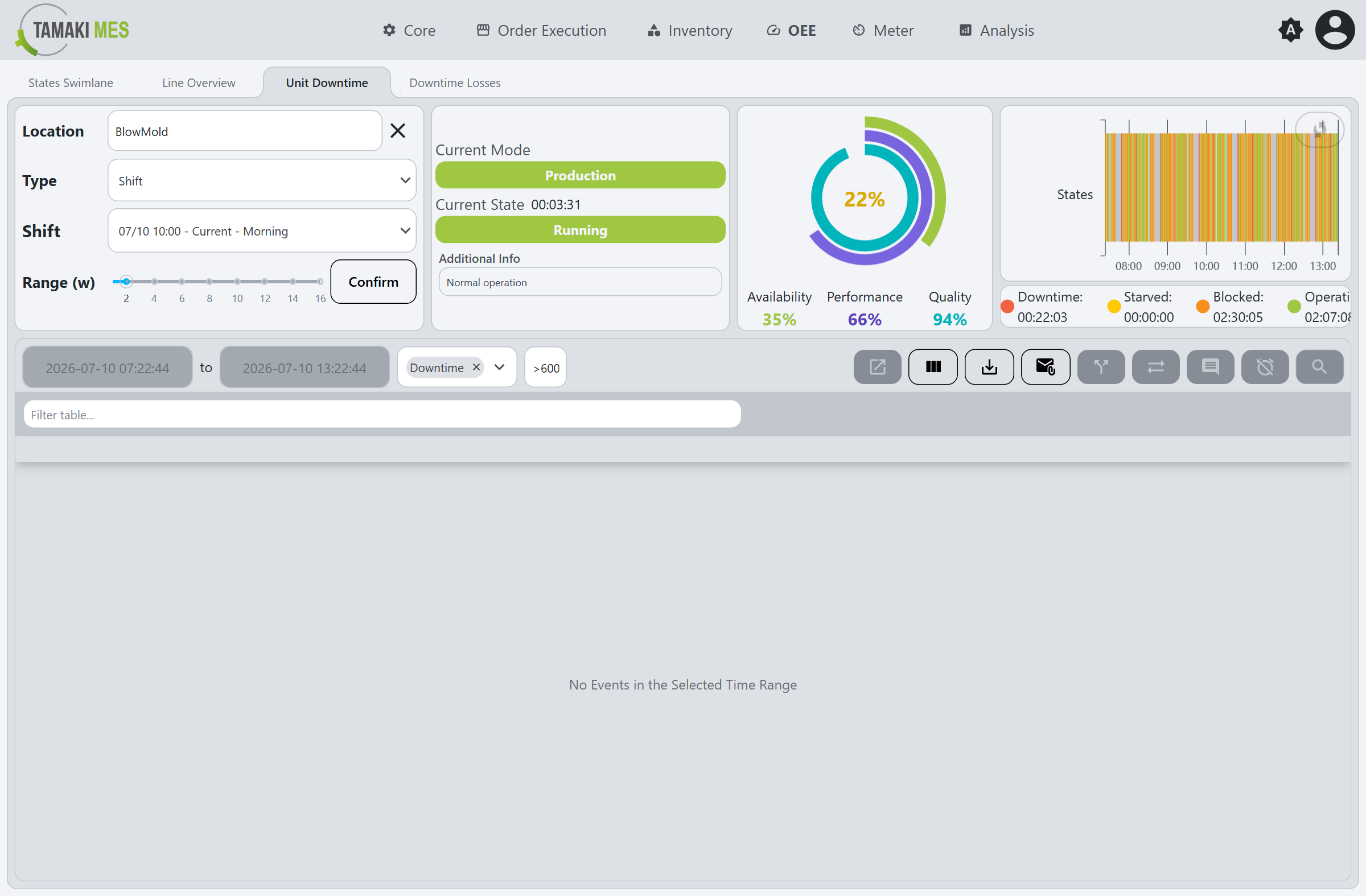
Focuses on a single unit: current mode and state tiles; a radial OEE gauge with the OEE in the center and concentric rings for Availability, Performance, and Quality; a states mini-swimlane with per-state duration totals; and an embedded downtime events table (the same table as Downtime Entry, with its time-range, type, and duration filters).
Downtime Losses
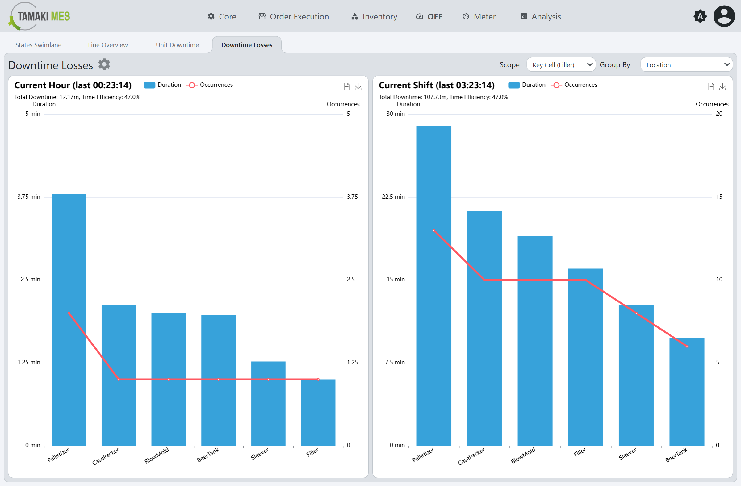
Compares downtime losses over two periods side by side - Current Hour and Current Shift - each a Pareto chart of total downtime and time-efficiency, with bars for duration and a line for occurrence count. The Scope dropdown chooses which part of the line to analyze (for example a key cell), and the Group By dropdown chooses how the losses are grouped (for example by location).